B2C / Mar to Sep 2023
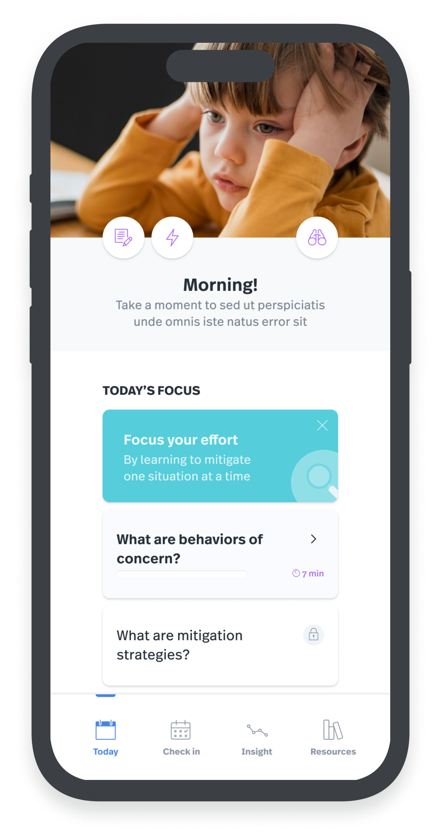
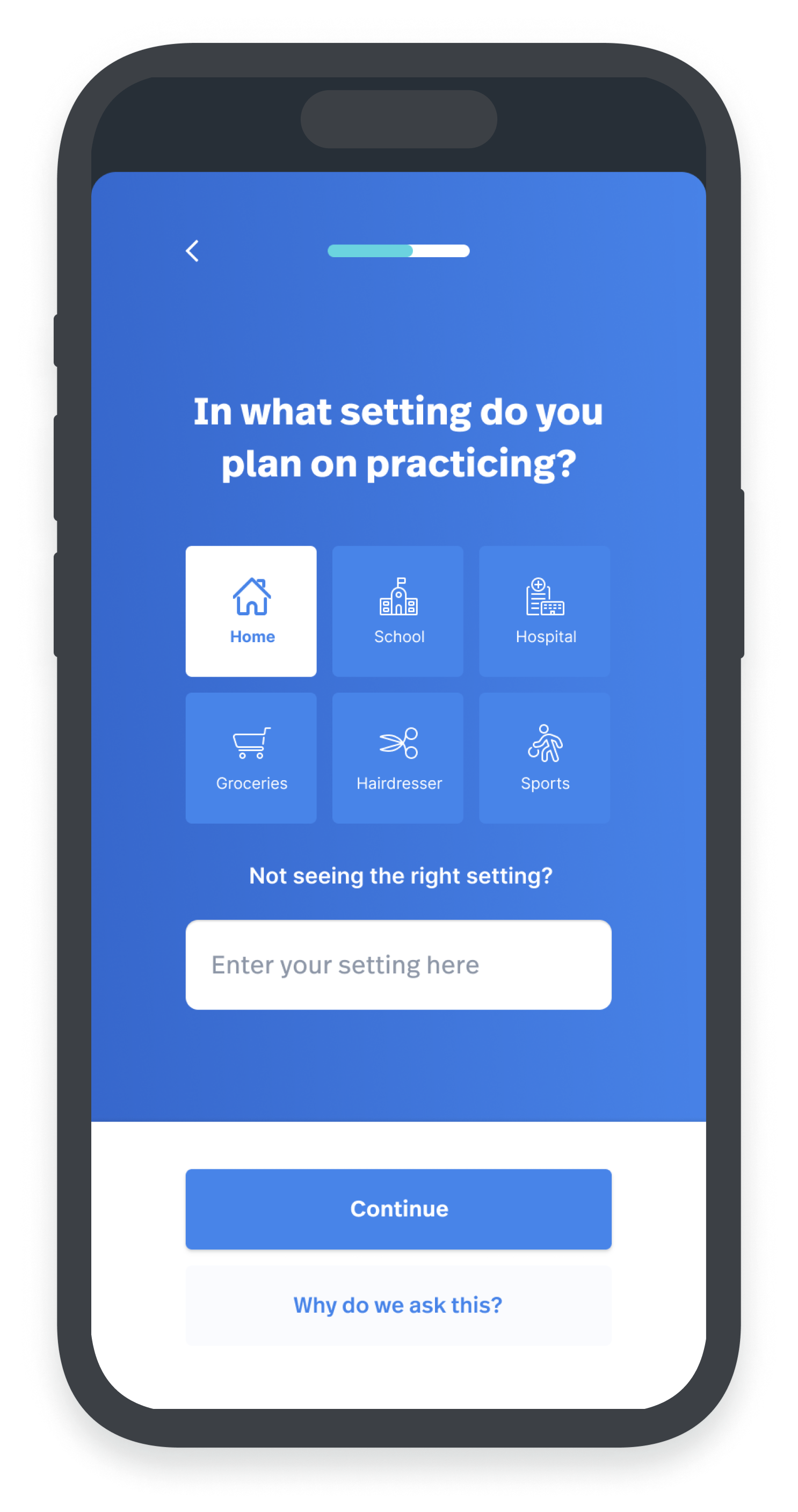
Autism Speaks is a non-profit organization that raises awareness and sponsors projects that leverage technology to support families of individuals with Autism Spectrum Disorder (ASD). The goal of the project was to design an application that aimed to help caregivers learn how to mitigate their child’s behaviors of concern, such as meltdowns, aggression, destructive behaviors, and self-injury. As lead designer, I was responsible for co-facilitating interviews with patients and caregivers, understanding their family’s pain, identifying the attributes of the future product’s UX vision, suggesting a UX architecture, developing new concepts based, also in part, on an analysis of existing solutions, producing high-resolution designs.
Speaking with users
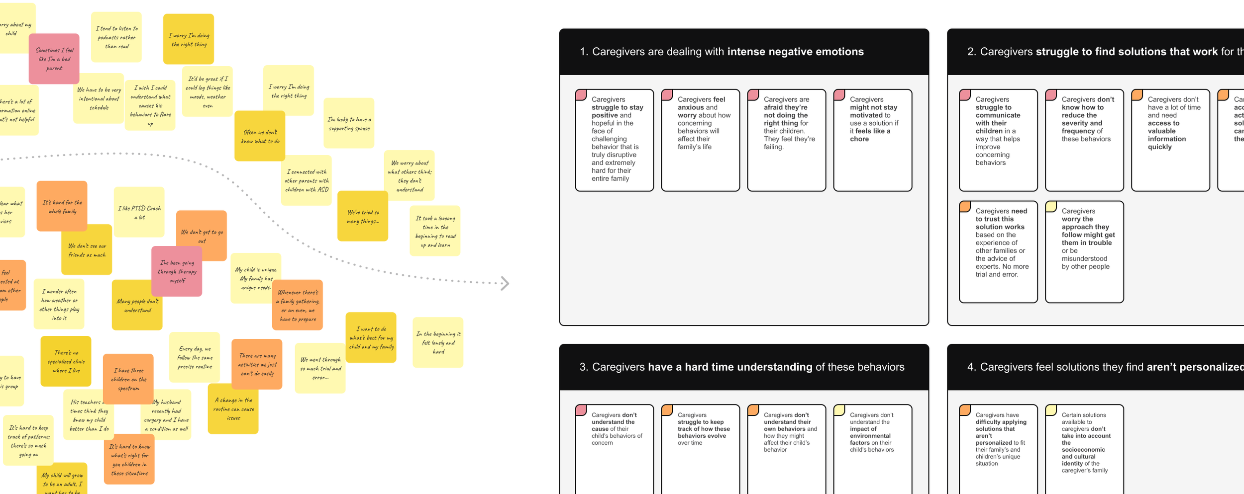
I co-facilitated a series of 9 interviews and found that caregivers of children with ASD:
feel very intense negative emotions such as overwhelm, worry, dread, and hopelessness
don’t feel empowered to influence the frequency and severity of behaviors of concern
go through a lot of trial and error to understand what was driving these behaviors
struggle to find solutions that they perceive as actionable and personalized
feel very isolated as they learn to manage their child’s ASD.
Looking at existing solutions
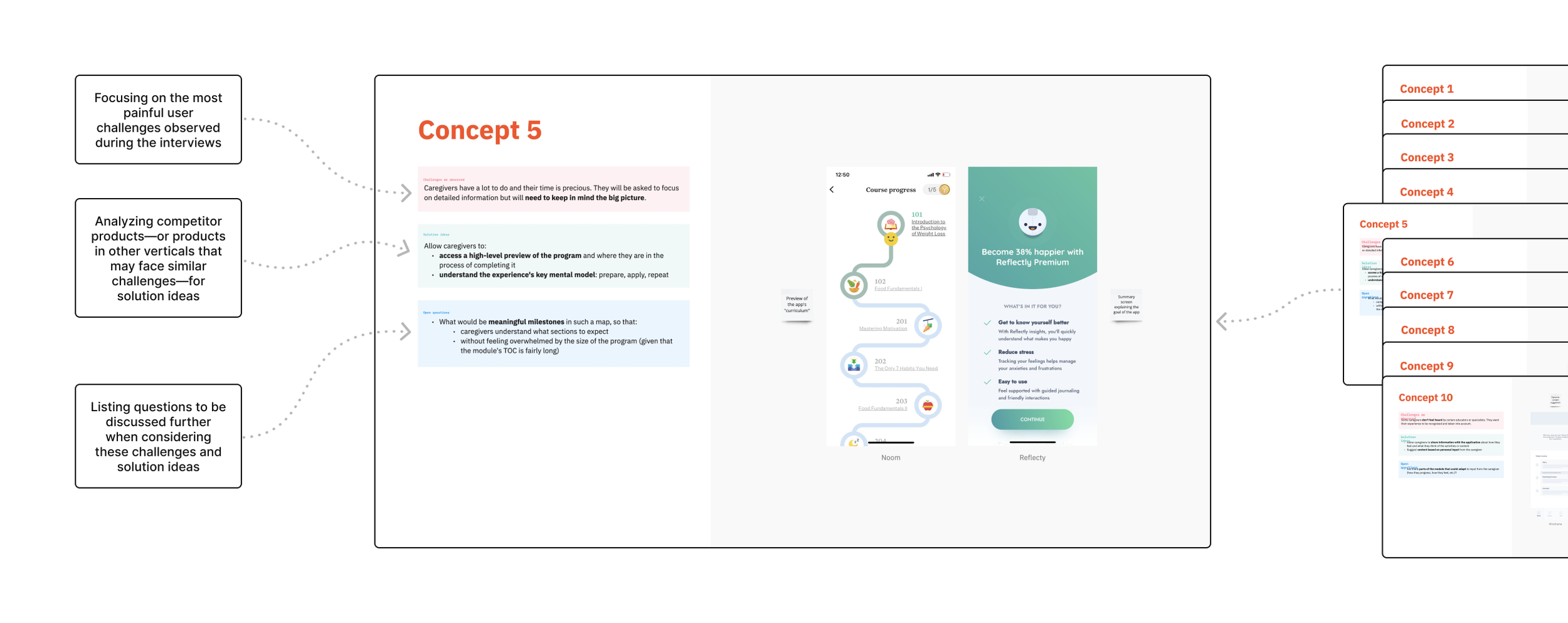
In addition, I analyzed existing solutions by looking at competitor applications or solutions built on similar mental models (e.g., educational apps like Headway or training apps like Strava) or targeting similar emotions (e.g., meditation apps like Calm or Breethe).
Definition of the flow
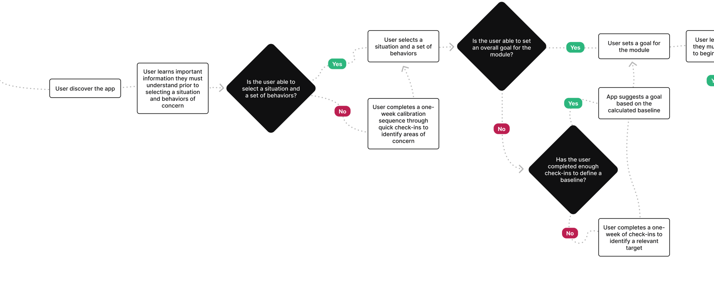
I led ideation sessions, internally and with the client, to identify a flow that would contain the right balance between learning and action-oriented content, to walk the line between asking so much of users so that they drop off, and asking too little so that they don’t get the value they hope to achieve through the app.
User interface design
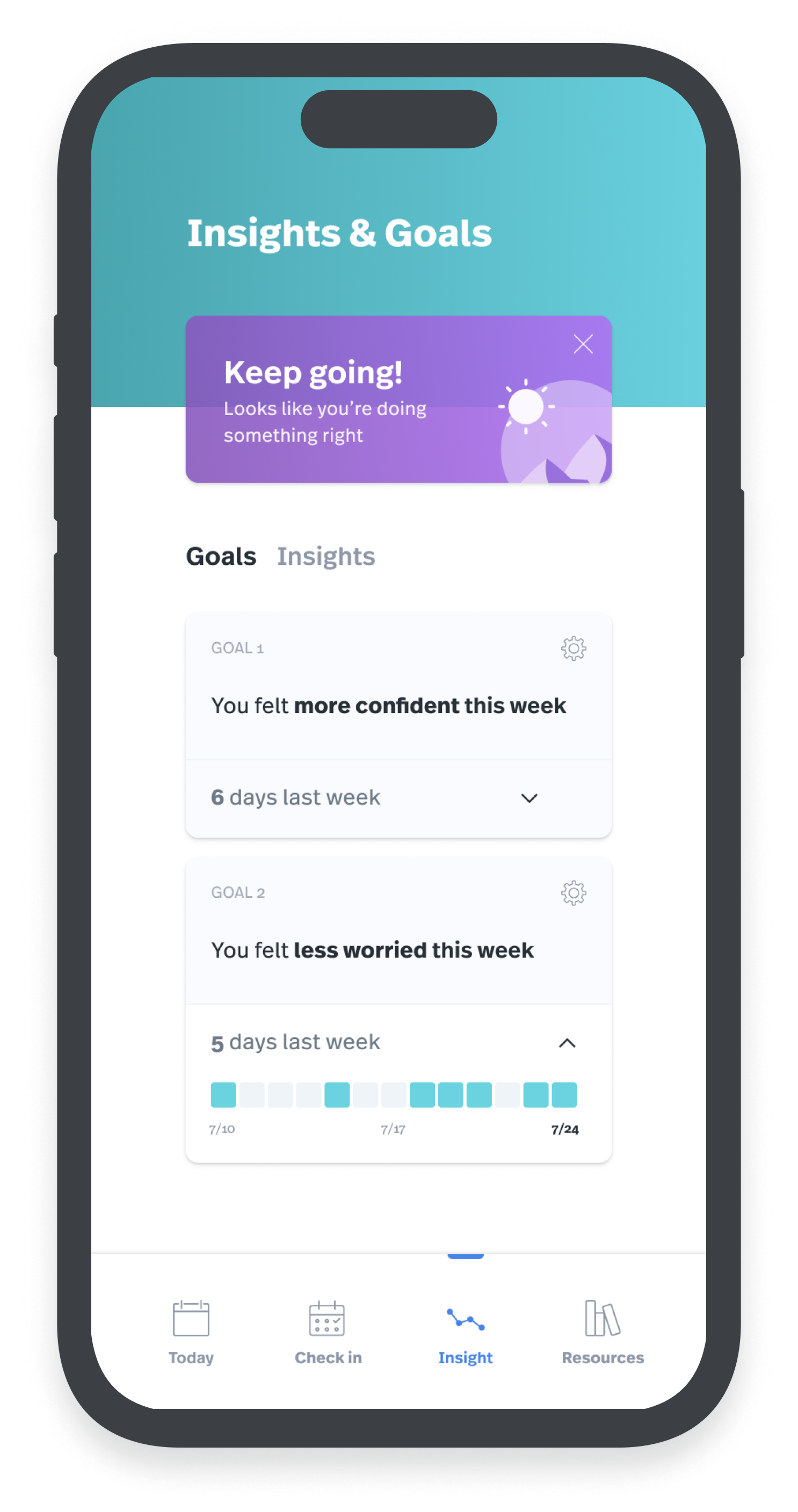
I then led the ideation phase to identify solutions that would reinforce positive emotions by adopting an empowering, positive tone; giving caregivers a space to reflect and recharge through journaling and access to self-care resources; breaking down the app’s educational content into actionable and achievable chunks, share valuable insights into the cause and evolution of behaviors of concern, through personalized suggestions and data visualization; encourage engagement through goals and quick check-in reminders.
Takeaways
TAKEAWAY 1
The client’s team had created a large amount of content, a curriculum designed to help caregivers learn to mitigate behaviors of concern. The quality of the content was undeniable, but its length, density, language level, sequencing, and format risked making caregivers feel overwhelmed and drop off. We had to be very intentional and work from our research rather than be led by the existing content.
TAKEAWAY 2
In addition, what the client had produced front-loaded a lot of purely informational content, whereas we had found caregivers were also looking for actionable and concrete tools they could implement with their child right now. Through multiple iterations, I helped the client rethink the tone and organization of their content to find the right balance between action and learning-oriented information and be much more intentional about what content to highlight or to disclose progressively or even optionally.


